
When you’re trying to choose a great looking WordPress theme, you are fortunate to have so many possibilities in the design you choose. The themes continue to evolve and impress users. In addition, the use of mobile devices is causing WordPress to evolve even more so to accommodate the need for designs to respond well to smartphones and tablets.
When a responsive theme is used on WordPress, the theme will adapt to the size of the screen it’s being viewed on because it’s flexible to any device you view it on. When you’re ready to update your WordPress site to have a responsive theme that will work for your mobile device viewers, here is a look at some of the best ones on WordPress.
Brooklyn

Brooklyn is a great place to start if you’re trying to pick a responsive theme on WordPress. It’s one of the best themes for those that need a responsive theme and it’s perfect for mobile browsing. It’s a top choice according to developers.
X | The Theme

Another great choice is X, a model that just came out in 2015. It’s very modern and futuristic and you’ll be amazing by its look based on the 30 demo sites it’s on now. It is one of the best themes for responsive designs offering a completely fluid design with no need to change at certain fixed breakpoints.
Inception

For those that love a simple one-page design, Inception is the perfect choice. It offers beautiful animations, smooth transitions and a simple set up. It’s fully responsive and perfect for those needing mobile compatibility.
Salient
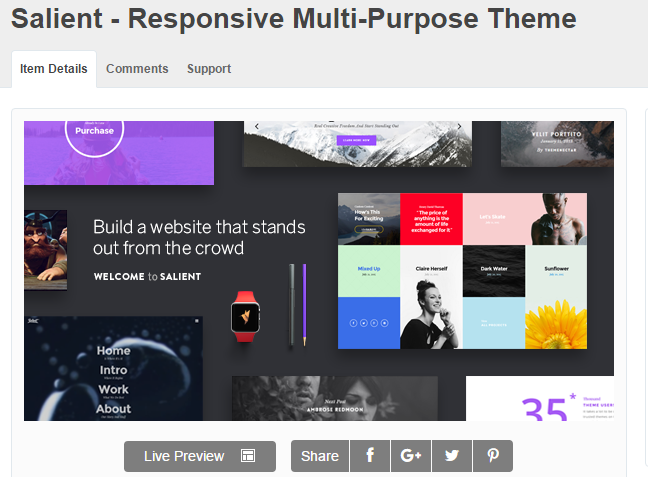
One of the most flexible options is Salient, a theme that transforms for any device you want to see it on. It has an easy-to-use drag-and-drop page builder, plus many theme options. It offers gorgeous visuals, support for retina displays and you are guaranteed to have images and videos that look amazing on any device.
Story

If you love a modern design, Story is a great choice for your responsive theme. It features parallax animations, a variety of designs and it supports finger gestures for those that wan t a gallery on their site. Navigate effortlessly through the images on any mobile device.
Other responsive themes that you’ll want to check out include The Retailer, perfect for retail businesses; Worker for those running a small business and need an appointment calendar; Qua, for a minimalistic appeal and perfect for the creative type; and Hugo, for those looking to show off their portfolio.
These are the best responsive themes for WordPress that you’ll want to check out.
